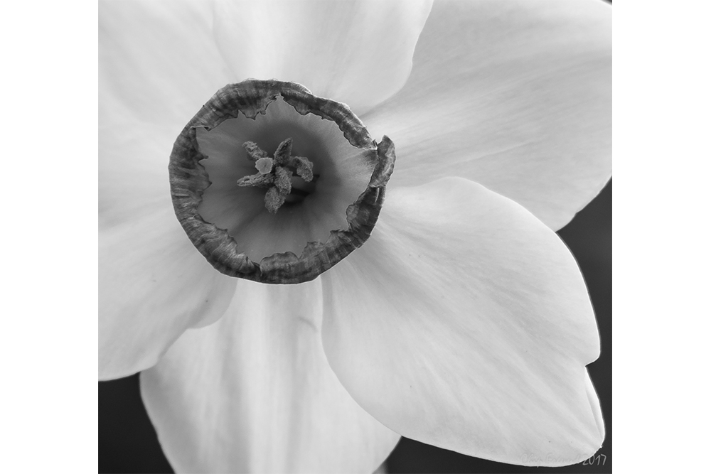
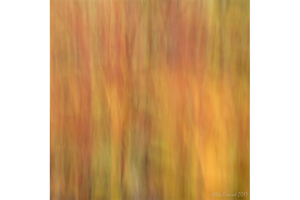
When I set out to create this portfolio I had a number of objectives. First was to produce a work product I was proud of and could put forward for mt first portfolio review (see post on Reflections of Nature Visions Photo Expo). Second was to include samples that represent the different styles and subject matter I enjoy working with.
As with so much in life, first impressions are critical in getting off to a good start. I needed a way to package and present my work that reflected the care and quality I strive for in my images. Thanks to Robert Rodriguez Jr, a landscape photographer based in the Hudson River Valley of New York, I first became aware of Dane Creek Folio Covers in a video of his and I was immediately struck by simple and elegant design. Thanks to Robert for a quick response to my email inquiry, I was able to contact Dane Creek and purchase a handful of the folios to try for myself. They are available in a few colors and are made of a high-quality card stock. The folio have four flaps that is pre-creased to easily allow them to fold over and lock together.
Well that is enough on the packaging. You can learn more about the folio on the Dane Creek web site. All prints were made with a Canon Pixma Pro-100 printer with Canson Infinity Rag Photographique 310 gsm paper.
Now on to the question of which images to include. If you have spent any time in my galleries, it is clear that I have a variety of styles and subject matter. Typically a portfolio would have a clear theme or unifying element that holds it together as a body of work. This collection was a bit different, more of a “best of” approach. The images I included are in the carousel below. I opened with “Mirror in the Fog” and progressed through a series of monochromatic images and then transitioned in a series of color image, ending with my impressionistic, “Fall Colors”.
![Lake_Johnson_Fog-8[1].jpg](https://images.squarespace-cdn.com/content/v1/59bc2c471f318dc024594aae/1543970867980-FSOM7EVIB52TVN3UUAN5/Lake_Johnson_Fog-8%5B1%5D.jpg)
![StormyTybeeLight[1].jpg](https://images.squarespace-cdn.com/content/v1/59bc2c471f318dc024594aae/1543970980060-CBC7Z7GDCCHQ3VP9U4EX/StormyTybeeLight%5B1%5D.jpg)
![TybeeJetty-1[1].jpg](https://images.squarespace-cdn.com/content/v1/59bc2c471f318dc024594aae/1543970915101-YWDQ2MPIYRT0I2UNQE39/TybeeJetty-1%5B1%5D.jpg)

![DriftWoodStump[1].jpg](https://images.squarespace-cdn.com/content/v1/59bc2c471f318dc024594aae/1543970897103-E4FT7G1242RQY9U63I6H/DriftWoodStump%5B1%5D.jpg)


![MorningHasBroken[1].jpg](https://images.squarespace-cdn.com/content/v1/59bc2c471f318dc024594aae/1543970935422-KB85O7UT50SBT4A0K7BJ/MorningHasBroken%5B1%5D.jpg)
![SeattleWheel[1].jpg](https://images.squarespace-cdn.com/content/v1/59bc2c471f318dc024594aae/1543970991684-I9ZH80W3990MNLRQB9XK/SeattleWheel%5B1%5D.jpg)

My portfolio reviewer, Thomas Heaton, took a thoughtful approach, asking me at the outset what my needs or goals were in this review. My response was that I wanted his thoughts first on the packaging and presentation (he loved the folio and my paper choice by the way), and more importantly I wanted his thoughts on my images. Their strengths, weakness, overall appeal. The learning I came away with was that overall of have a strong collection of images, although they were not all of the same level of quality and as such Thomas suggested that an image or two might be removed as to not distract from the rest.
More importantly, I learned that I really don’t need someone else to validate my work. I am the critic I need to please. The last session I attended at the Nature Visions Photo Expo, “Finding and Following Your Vision” presented by Cole Thompson underscored this idea.
I had to admit that there were a few images in the portfolio that I really didn’t love. In one case I loved the idea I had for the image, but the actual photo fell short. With another, there were a couple of technical flaws that distracted from the intent and feeling I had in mind.
So how might I approach this project the next I prepare a portfolio. First and foremost, I will only include images I truly love. Second, I will assemble a collection that is held together by a unifying theme or principal. Why might I create another portfolio? Perhaps to share my work with friends, fellow artists, or even a gallery. I think this packaging also lends itself to packaging for sale of a collection, similar to a box set.


